My Time At Sandrock Review –- A Rocky Performance for Switch Players
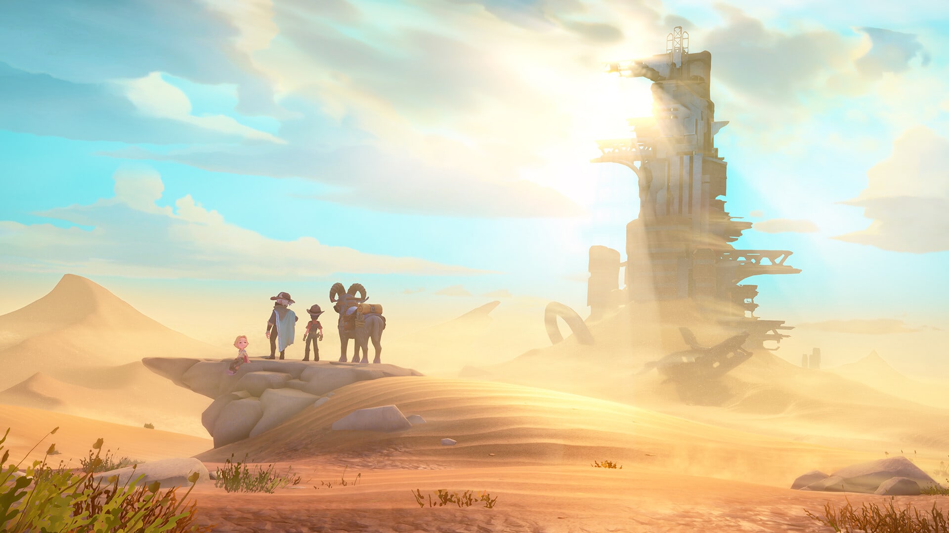
One of the best things about a life sim is how it begins. Often the player is thrust into a small town, having some sort of connection to it. In My Time at Sandrock, things are a little different: you’ve headed to this town as a fledgling Builder, someone looking to take up the mantle and help this desert community thrive.
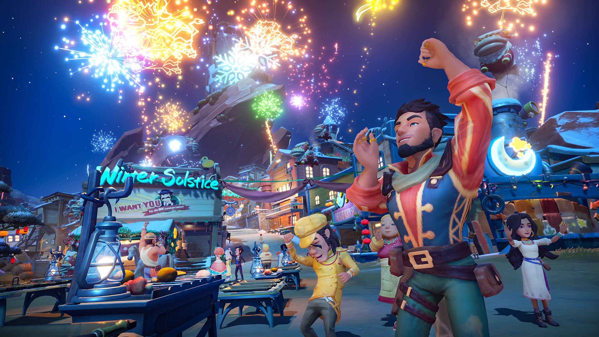
Unfortunately for My Time at Sandrock, its performance on the Nintendo Switch makes it so that even wanting to play more than a couple hours at a time feels like an impossible feat. Not only do the characters and environment look blotchy and unrefined, but there were plenty of times when frames would skip over one another, leaving the player character hard to control — particularly during combat sequences.
This abysmal performance is something we’ve been told the game developers are aware of, and its performance will be fixed, but as of now? I can only allow this review to reflect my experience. It should also be noted that My Time at Sandrock’s performance issues were not constant, but still enough that I would advise not purchasing or playing this game on the Nintendo Switch at launch.
Before you can get started and step into this new community, however, you’ll need to actually create who you are. It’s clear that there’s been effort here to expand on the customization of the previous game, My Time at Portia, but there (sadly) still are some missing modern features that I was disappointed not to see offered. For example, there was seemingly no non-binary option here, meaning you could only choose to be male or female. This boggled my mind considering the characters you meet only address you by your job title as Builder, and that more and more life sim games (such as Story of Seasons) are offering more ways for marginalized identities to express themselves in meaningful ways.

That said, there are a wide variety of other customization options for players, with a variety of detail. You can change your hair and its colour, your face shape, tattoos, and even the depth and perception of your pupils. If you want to be a green alien from outer space, then you can! Which, honestly? Makes the lack of non-cis options feel even weirder. But I digress.
Once you’re done, you hit the ground running. You and your fellow Builder Mi-an are off to deal with the many problems that plague this sandy community. With the old Builder on the way out and a mayor who seems more concerned with making everyone happy with false promises, it’s clear that things need to be changed around here, and you are the person to do it. Only, it becomes pretty clear early on that Mi-an is the most important figure out of the two of you. On the surface, that’s fine, especially because Mi-an (and a lot of the others you meet in Sandrock) genuinely rules. However, it becomes harder to ignore how pivotal she is when she’s 1) voiced and 2) many address her expertise over yours. Again, Mi-an is a brilliant character who I enjoyed getting to know during my time with the game, but at times I almost felt like part of the furniture, rather than a full-fledged protagonist.
What softens the blow somewhat is that the citizens of Sandrock are genuinely wonderful. Each and every day, I found myself rushing around trying to speak to everyone, simply because there was so much to do and explore that I wanted to hear what everyone else had to say about the events happening around them. In fact, I liked speaking to them more than the actual foraging and building that makes up the majority of the gameplay, simply because of the expert voicework and just how fleshed out some of these characters are.
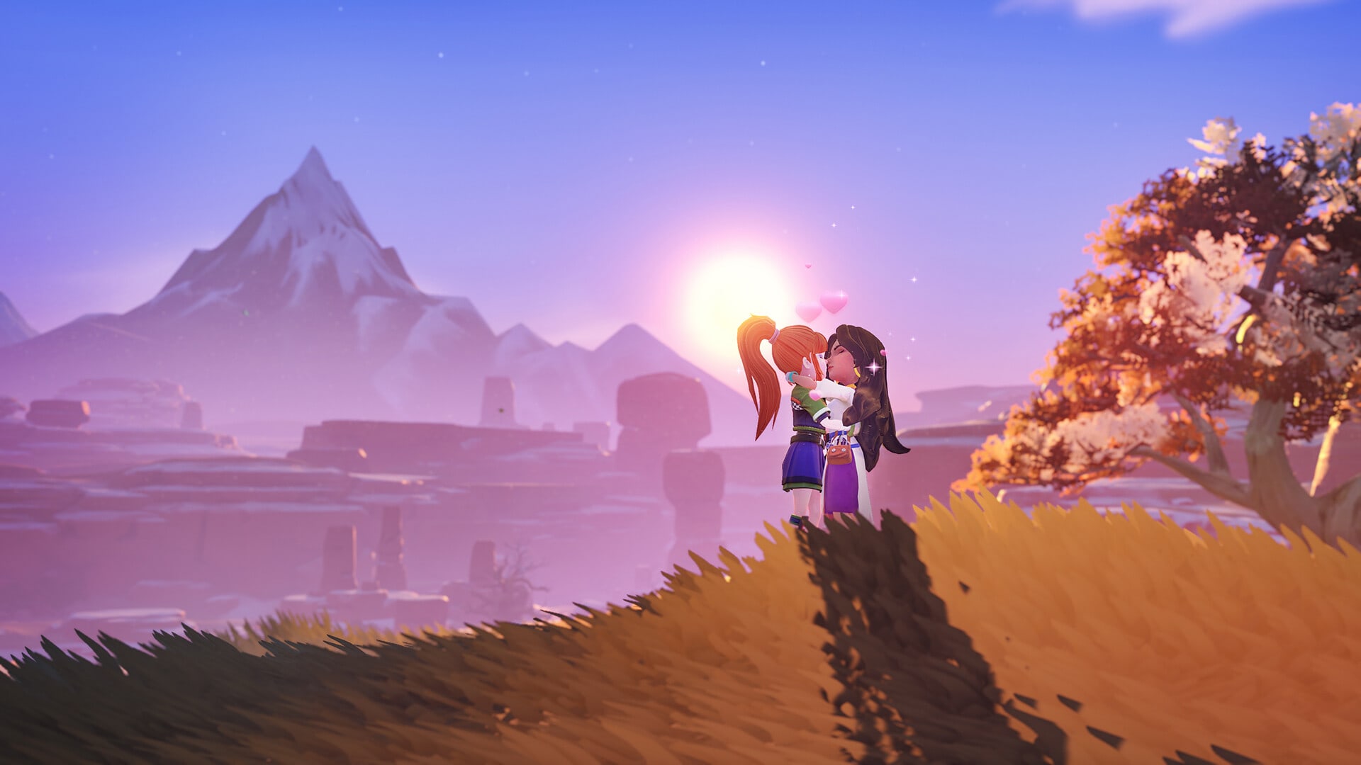
And, because this is indeed a life sim, you’re even able to get close enough to some characters and marry them. All of the romanceable candidates are available to propose to regardless of gender, and overall there are 21 romantic options for the player. There are more male romance options than female, which feels a little odd, but good news for all the gay men out there! Regardless: there’s more than enough choice to satisfy.

As someone who does love romance in video games, I did find myself impressed at the level of care that was shown in curating these relationships and making them feel real and non-transactional. While you can help fulfill your relationship even faster through the use of gifts, just speaking to these characters and doing their various tasks and missions also helps you get closer to them. Some relationships feel much faster, whereas others are more of a slow-burn, but either way? I’m sure gamers will find at least one character that suits their taste.
But, outside of its general performance on the Nintendo Switch, what lets My Time at Sandrock down is the level of bloat and clutter that makes up both its gameplay and UI. As a Builder, the way you improve is through refining tools, objects, and so forth, with higher tiers of quality slowly being worked towards over time. I’m an avid fan of life and farm sims, and the fun is all in seeing your hard work pay off, but I didn’t get the same feeling with this game. Progress feels slow and stilted, only made worse by just how clunky and unintuitive the building process is. Making things doesn’t necessarily have to be easy, but if I’m struggling with understanding which materials are needed and why in a game that’s about building, then something is very wrong here.
It also doesn’t help that My Time at Sandrock is very menu-heavy. The UI is also very clunky and pushed together in a really uninspiring way. It feels very menu-heavy, and while you can untrack quests to make it easier for you to see the screen, I question the decision to have so much jumbled together on screen when you’re trying to admire what’s happening in front of you, or doing something as simple as following a path set on the mini map. A lot is happening, and while I can understand the appeal for gamers who love nothing more but to dive deep into menus and tick off those metaphorical boxes, I quickly found it overwhelming. One of the best things about farming and life sims is how they ease you into it. But this isn’t the case for My Time at Sandrock.
What’s really frustrating about all this is that I can tell there’s a good game — somewhere — in My Time at Sandrock. The building aspect is clunky, but shows promise with how much you can actually design and curate to suit your needs, and the characters all feel significant and special. But that doesn’t change the poor performance, the vast difference between how the game looks on the Nintendo Switch, and an overwhelming amount of bloat that makes even the simplest of quests feel like a chore.
There is potential to be found for My Time at Sandrock. It’s just not on the Nintendo Switch.
[Developer Update on 03/11/2023]
PM Studios and Pathea will continue working hard on improving all the issues highlighted in the pre-launch reviews of My Time At Sandrock. On top of this patch which fixes over 180 issues highlighted including fixing numerous UI issues (including item descriptions occasionally disappearing in-game), improved resolution for key objects, better FPS in dungeons and mini-maps, NPCs not moving their mouths in dialog and cutscenes and reducing the likelihood of larger objects popping into user view rather than emerging organically in the open world. There are more updates planned to bring the Nintendo Switch version in line with the other console versions and we’ll have more details on this via Reddit.
Score: 2.5/5
A review copy of My Time At Sandrock for Nintendo Switch was provided to Gayming Magazine by PR.


